Enhanced Checkout
Problem: The checkout processes tens of millions of dollars per month in revenue from our clients/users. The checkout has been used for quite awhile by our clients is outdated and is an overall frustrating user experience. Checkout abandonments are very high on average with the old checkout.
Solution: An enhanced checkout experience that focuses on users to decrease time needed for checkout completion and improved usability
Goals: Increase revenue and eCommerce conversion rate. Decrease checkout abandonments

Results
eCommerce Conversion rate: An average increase of 0.11% was seen with our Beta clients, contributing to their rising revenue and orders
Results
eCommerce Conversion rate: An average increase of 0.11% was seen with our Beta clients, contributing to their rising revenue and orders
User Research
For this checkout redesign, several different types of research were used in order to maximize efficiency going forward and providing an enhanced experience for our client’s users.
We had a Baymard UX Audit completed on one of our client’s sites and reviewed the data and recommendations provided back to us.
I utilized the vast library of Baymard Premium to access 49,000+ of eCommerce user research in order to make better design and UX decisions.
Additionally, I completed Competitive Analysis by scrutinizing various top checkouts of both eCommerce individual retailers (e.g. Best Buy, wayfair, Walmart, etc.) and eCommerce software companies (e.g. Shopify, Magento, BigCommerce) to see how competition design their checkout procceses.
Approach
After meeting the funding clients by flying to Florida and gathering the requirements, I started the research and design process. Using the compounded information provided by the research and competitive analysis, I created a wireframe and user flow to achieve and optimized checkout process to would be easy for our direct client users to install and maintain on their ecom sites and well as for the B2C online shopping users.
I presented the wireframe and userflow to the clients and stakeholders as well as the product team in order to gain initial feedback and to see if project requirements were met.
The fidelity increased as the task progressed, leading up to the high-fidelity prototype ready for development hand-off and testing.
Usability
Many usability decisions were made based on Baymard’s user research in combination with the Competitive Analysis and overall personal eCommerce experience. Usability Testing was also completed throughout the wireframing and higher fidelity processes. 8 users were tested in total during the initial design steps. Tested users were shown the prototype and evaluated on the ease-of-use and possible confusion points.
Currently, the update release is with our Beta clients and we are closely monitoring their use of the new checkout and receiving feedback from our clients and from their users.
Initial Launch Experience
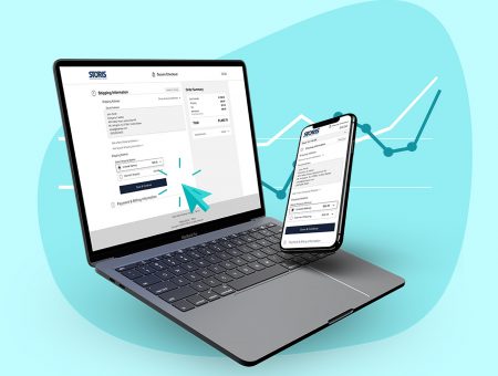
Checkout Features
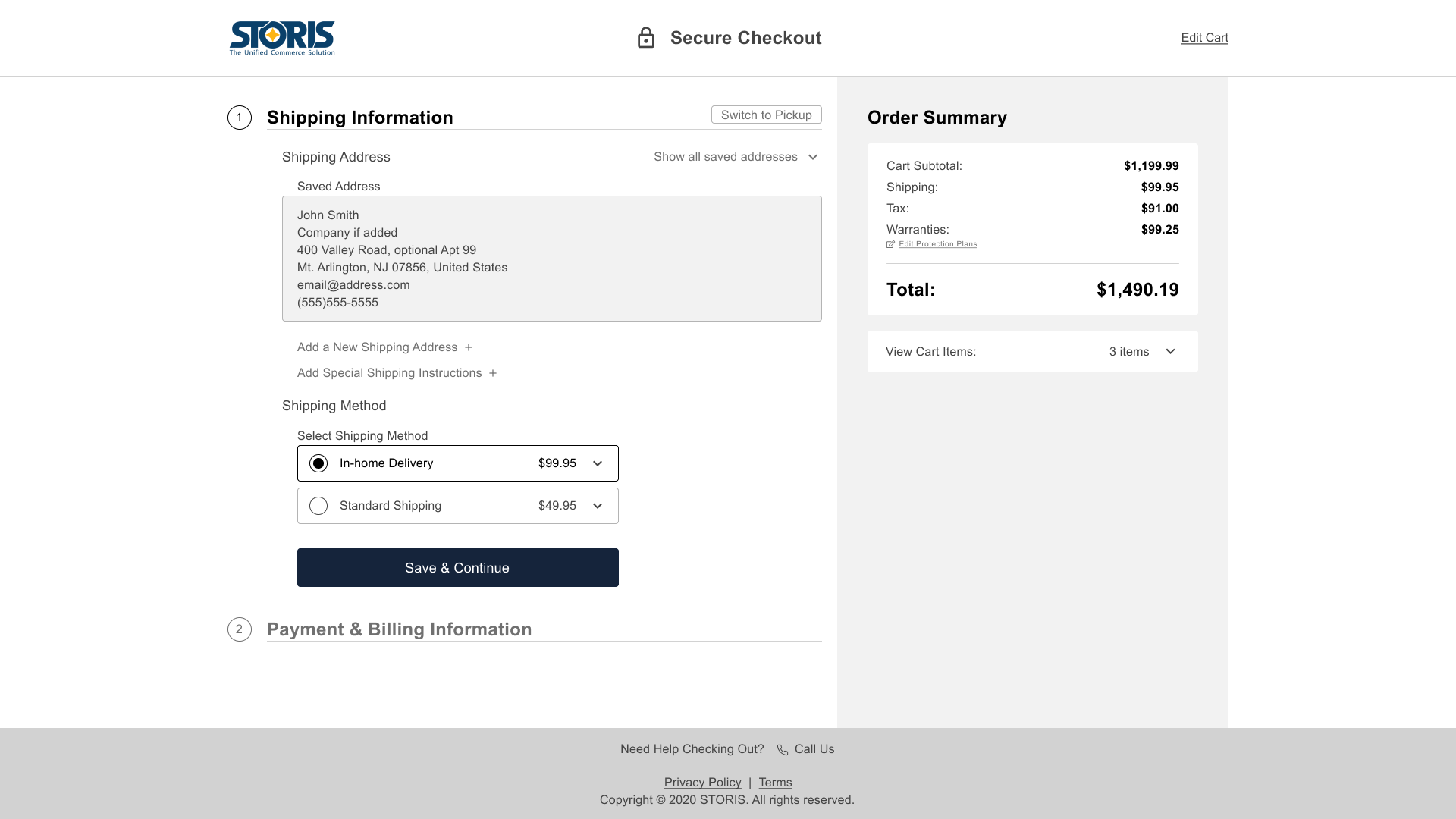
- Reduction of step buttons from 5 clicks to 3 for a saved user
- Removal of the eCommerce client navigation and complete separation into its own environment
- Adding saving ability so users would no longer lose all checkout progress if they went to a previous step
- Billing information is no longer the first step and is now Shipping/Pickup
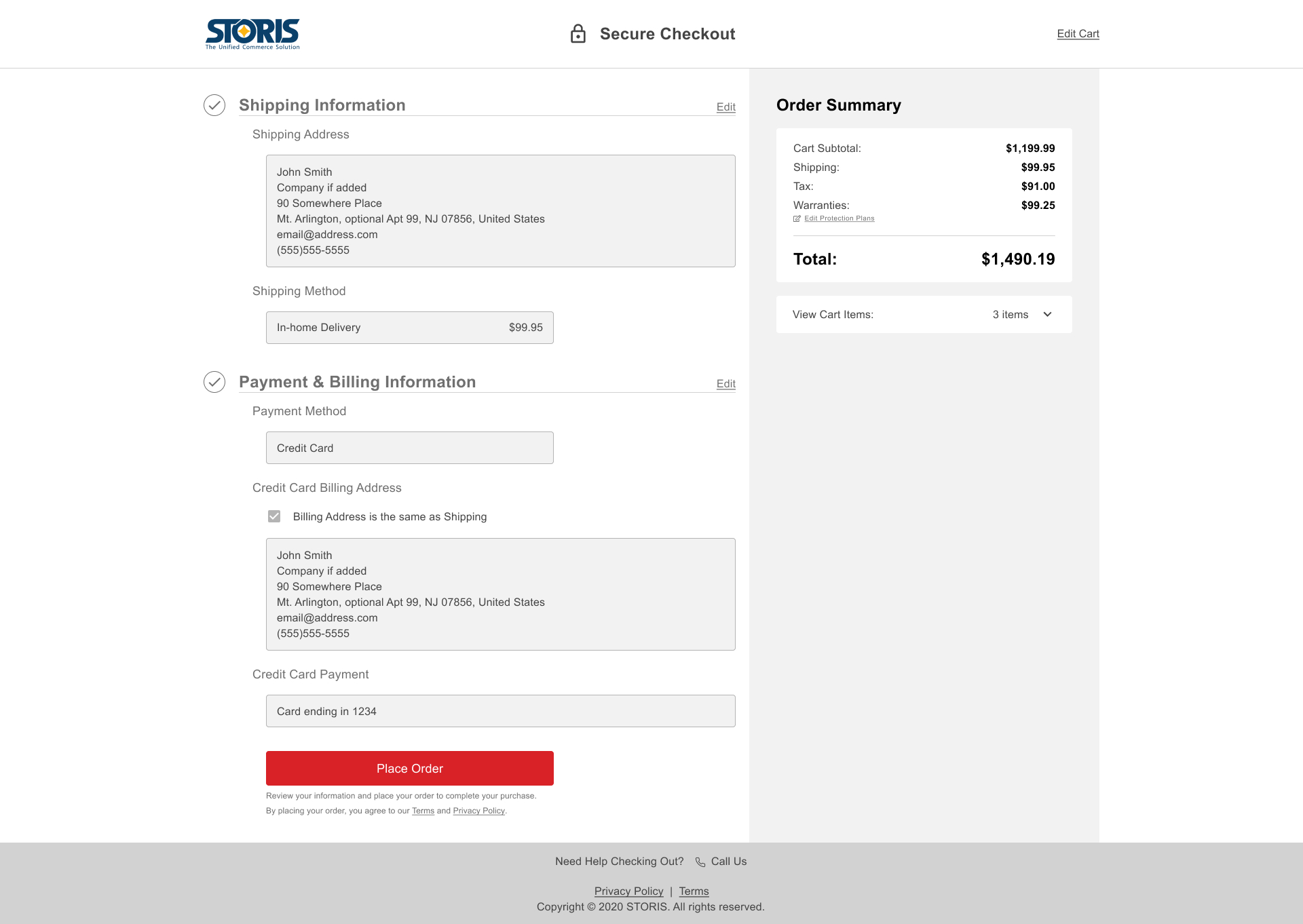
- Inclusion of the Terms agreement disclaimer to remove the checkbox agreement previously used in the cart before checkout
- Functionality of being able to see the saved information and having the ability to edit the step while in checkout
- Making the Place Order button sticky on mobile (and a separate color) to remind shopping users to complete their final step
Challenges
Many challenges presented themselves during this task:
- Trying to think of every setting a client user would need in order to customize and use their new Checkout Plugin efficiency while also maintaining minimalism to prevent future support efforts and code interference
- Working with the development team on where to make expensive calls (2-3 seconds) back to our software while trying to make important UX decisions to make the checkout easier and faster for shopping users. Reducing the calls to a minimum while enhancing the checkout experience for users was a give-and-take situation
- Prioritizing certain elements of the project in order to make the release deadline. Features have been left out to make the release time and will be included in future iterations/hot fixes
Desktop High-Fidelity Mockups
Post Launch Iterations
Financing
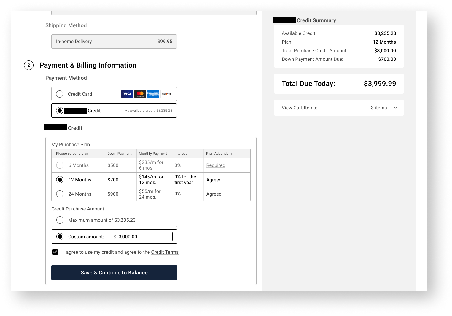
The new checkout process started as a client-funded project for them to have financing in checkout since they also operate as a bank in addition to a furniture retailer. Revolving financing was added into the secure checkout process. Registered users that have financing attached to their accounts can view the payment information about their cart and easily use their financing account to purchase their cart items.
Gift Cards
Gift card integration has been a highly requested feature. Clients can now host their own gift cards so their shoppers can use store credit just for their products. Of course, users/shoppers need a way to checkout using their gift cards so it was integrated into the new checkout providing a way to support the business in desperate times where inventory is close to none.
Delivery Scheduling
Delivery scheduling during checkout is also a very highly requested feature from both clients and their shoppers. Originally, shoppers/users need to purchase their cart completely, go into their account management, go to their orders, select the order they just created, and then change the desired delivery date in the order details. This flow has been greatly improved so shoppers can now choose when they want their items delivered while checking out.

