Manage Syncs - Cron Scheduler
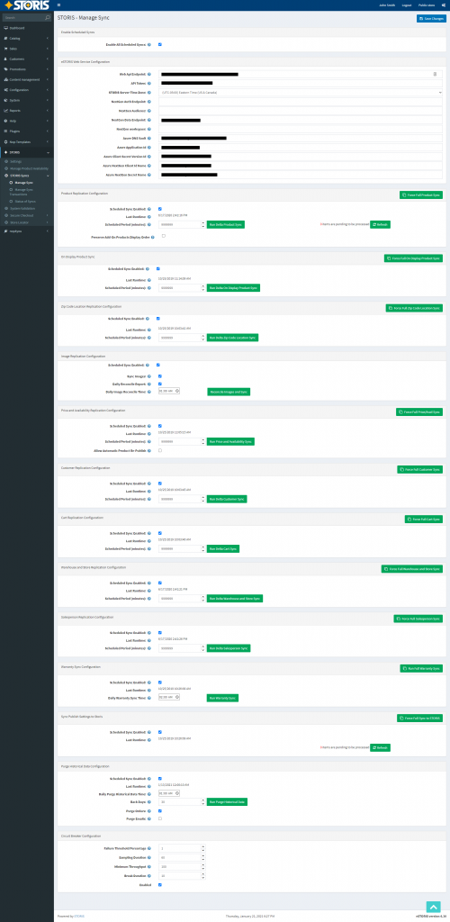
Problem: The Manage Syncs page is used to schedule, run, and diagnose the communication from the primary ERP software to the eCommerce site. This page was incredibly long and confusing and B2B user’s site would frequently go down because long syncs would overrun each other as there was no clear method to separate the syncs. Since this page was so confusing for users, they would often use the Force Full Sync which would again bring down sites for extended periods of time (as it is running all syncs at once).
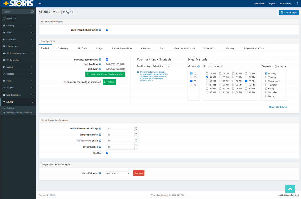
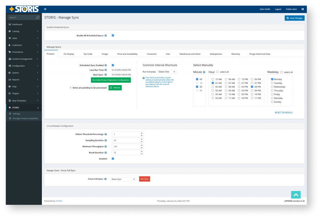
Solution: Working with the product team lead to the idea of creating a Cron Scheduler to have a clearly defined timeline for each different sync to run for easy scheduling. Additionally, I moved settings around to make the Force Full Sync less visible as it should rarely ever be used (as it is a last resort). The creation of the new Cron Scheduler includes a new Common Interval Shortcut for a faster setup and a clear Next Runtime so there are no confusions as to when the next sync would run.
Goals: Reduce cases logged for downed sites and the need for user assistance setting up syncs to run efficiently
User Research & Competitive Analysis
We received feedback from clients/users that they would like to be able to specifically schedule their syncs at low traffic times and only on certain days. A Cron Scheduler would allow for more flexibility than trying to calculate the amount of minutes that would equate into days.
I completed research by trying to find various Cron Schedulers and how it could potentially be presented to our users in the way that they need and could easily adjust to. There are not many examples or UX research for Cron Schedulers. The most recognizable inspiration was sought from the built-in Microsoft Cron Scheduler. However, it has a very dated design as it seems it has not been a screen that has been updated with the most recent OS UI.
Spec Requirements
- Simplify and rearrange the (ex)current Sync page for better legibility
- Be able to schedule syncs by minute, hour, and day
- Syncs cannot be run shorter than a 30 minute interval
- Make the Force Full Sync used less and help users understand that it should not be used regularly
- Clearly sort the various sync categories
Approach, Usability, & Challenges
No whole Cron Scheduler examples that I could find included the right solution for the spec’s requirements. This feature’s task was outside my comfort zone and built-up knowledge of tackling online commerce related problems and pushed me to find more creative solutions with less available UX research.
Since this page would be receiving such a great overhaul, I included tooltips to help guide users who upgraded to the new patch level to be able to hit the ground running in setting up their new syncs. Additionally, I included Common Interval Shortcuts with common setups that our users tend to gravitate towards (speaking with our internal implementations team who initially set up new users’ syncs were able to provide insight with these common choices). If a user selects a Common Interval Shortcut (e.g. every 30 minutes), then the right side would proceed to autofill with the appropriate selections so the user can immediately visibly see the result of their interval selection. To also help increase the understanding of when their next sync will run, I included a Next Sync display in the UI so users can feel at ease that the syncs are set up and running.
Our syncs can only run a max of every 30 minutes and there cannot be a shorter interval. In order to make that clear to users, if a selection in Minute is made, the 15 minute checkbox selections are thereby disabled. For example, if a user goes to schedule their Product Sync to run starting at 2pm and they start their selection with 00, 15 and 45 would auto disable to prevent scheduling the system resources cannot handle. Hovering over the Minute tooltip also tells users that 30 minute intervals are the shortest a sync can run at.
The Sync Enabler, Delta Run, and Pending Items remained clearly on the left so users could see familiar information from the previous Syncs Page and predominantly show that vital summary information at the start.
To help clean up the page for better legibility, I moved the initial web configuration settings into another Settings panel in the administration dashboard as this information is just set up during implementation and is rarely used again after that. It was better suited to be amongst other settings that are set up which also saves more clicks/time for the implementations team.
Additionally, as mentioned above in the Solution, I repositioned the Force Full Sync at the bottom of the page and styled it in a way that made it more clear to users that it should not be used unless in an emergency or by our own tech support team.
Before Patch Update
After Patch Update